Task Interactivity - Popup
The Popup Task shows a message in the VisualCron Client of one or more users and returns the user's reply, the button they clicked or the values they entered, as the Task output and result.
Use it to:
- show a simple message
- show a message and return the button the user clicks
- show a message and return input from text boxes, check boxes, radio buttons or a combo box
A popup as a user sees it:
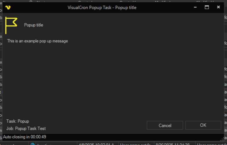
Mask input hides typed text in the popup only. When the Output sub tab is set to "Input values", the Task output contains the text as the user typed it. With Task debugging on, the values are also written to the log. Do not use the Popup Task to collect passwords.
The Main settings, Flow, On error, Conditions and TimeOut tabs are the same for every Task; see Job - Tasks.
Popup tab
The Popup tab has the sub tabs Main settings, Target, Buttons, Input, Result and Output.
Popup: Main settings sub tab
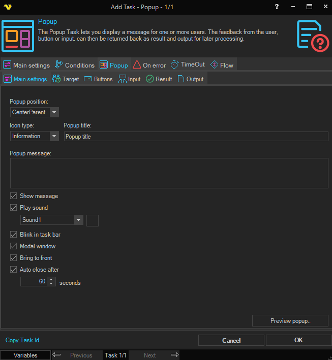
- Popup position: Where the popup window opens: "CenterParent" (the default), "CenterScreen", "WindowsDefaultBounds" or "WindowsDefaultLocation"
- Icon type: The icon next to the message: "Information" (the default), "Exclamation", "Question" or "Error"
- Popup title: The title shown in the popup; "Popup title" by default
- Popup message: Optional; the message shown in the popup
- Show message: When selected, the message is shown
- Play sound: When selected, the popup plays the selected sound, "Sound1" or "Sound2", when it opens. Click the button next to the list to hear the sound
- Blink in task bar: When selected, the popup's button in the Windows task bar flashes
- Modal window: When selected, the popup blocks the other windows of the VisualCron Client until it is closed
- Bring to front: When selected, the popup is shown on top of other windows
- Auto close after: When selected, the popup closes after the number of seconds set, "60" by default. A popup that closes this way returns the "Cancel" dialog result
- Preview popup..: Shows the popup in your own Client, to test it
All check boxes on this sub tab are selected by default. Variables are resolved in Popup title and Popup message.
Popup: Target sub tab
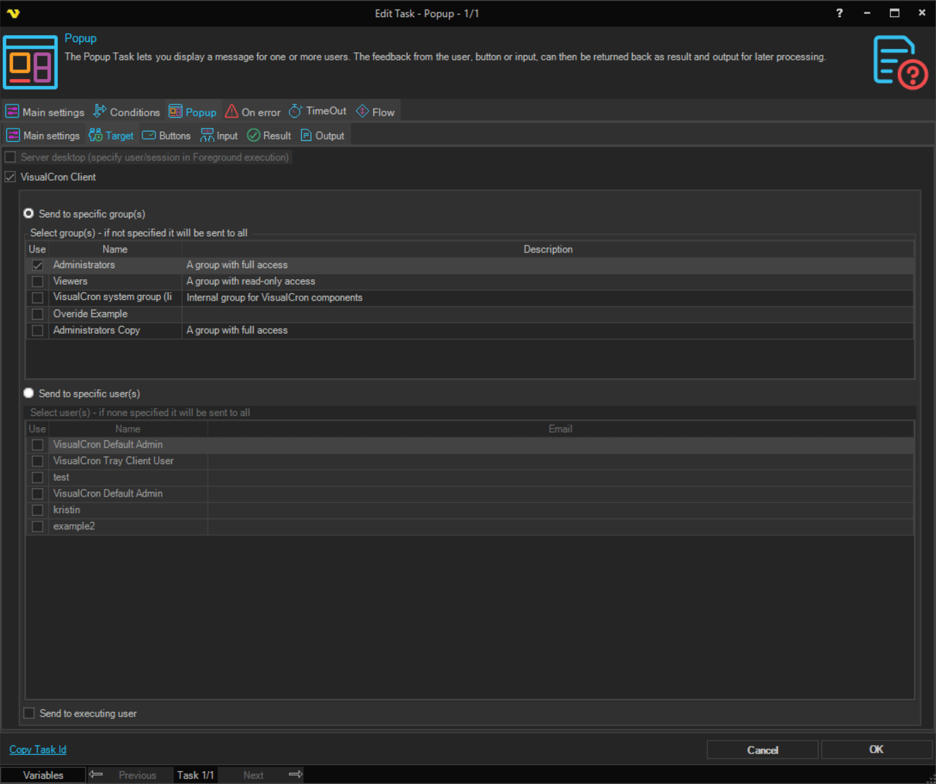
- Server desktop (specify user/session in Foreground execution): Shown, but not available
- VisualCron Client: Sends the popup to VisualCron Clients
- Send to specific group(s): Sends the popup to every connected Client whose user is a member of a group selected in the list
- Send to specific user(s): Sends the popup to every connected Client of a user selected in the list
- Send to executing user: Also sends the popup to the Client connection that started the Job
Select at least one group or user, or Send to executing user. The Client does not save the Task without a target, although the list captions say that the popup goes to all when none is selected.
The popup reaches only users whose Client is connected to the Server when the Task runs. If none of the targets is connected, the Task fails with "No target Connection found". When the popup goes to several users, the Task uses the first reply it receives and ignores the others.
Popup: Buttons sub tab
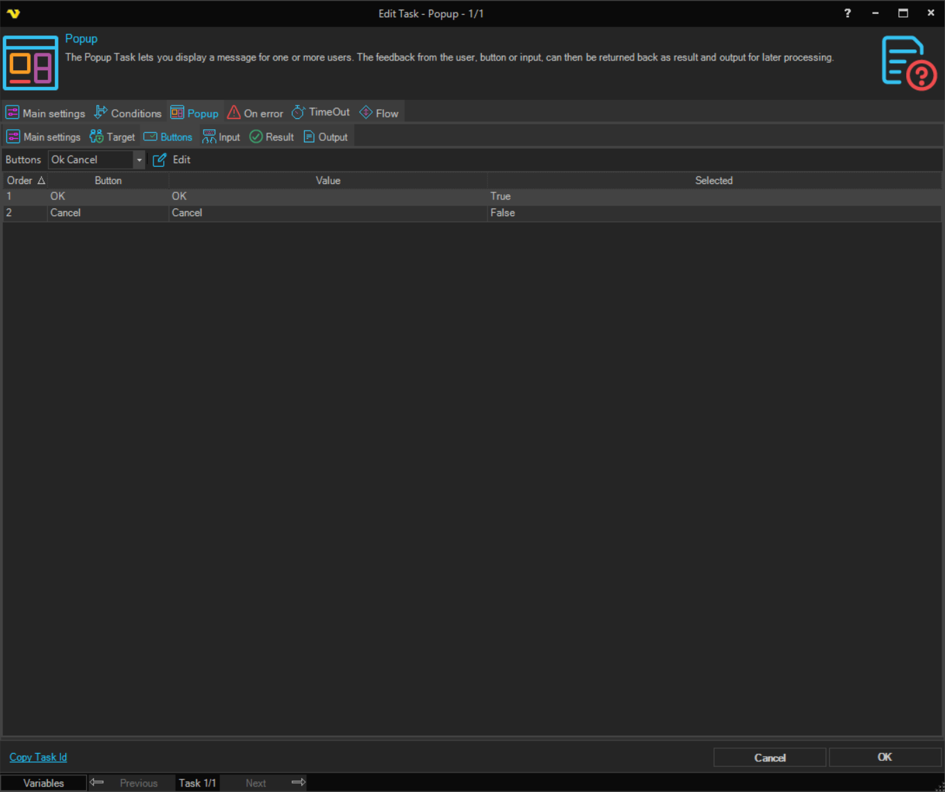
- Buttons: The set of buttons in the popup: "Ok", "Ok Cancel" (the default), "Abort Retry Ignore", "Retry Cancel", "Yes No" or "Yes No Cancel"
- Edit: Opens Edit button value for the selected button, where you set the Value the button returns
A button's value is its name by default. The Result sub tab decides whether a button makes the Task succeed or fail. With "Dialog result" on the Output sub tab, the value of the clicked button is the Task output.
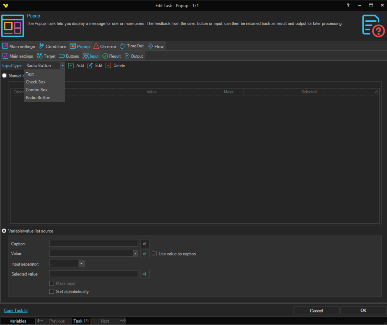
Popup: Input sub tab
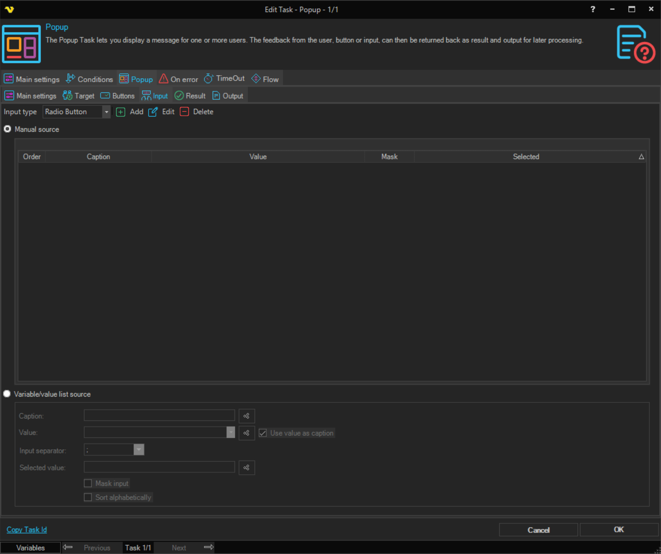
The Input sub tab adds optional input controls to the popup. To return what the user enters, set the Output sub tab to "Input values".
- Input type: The kind of control: "Text", "Check Box", "Combo Box" or "Radio Button" (the default)
- Manual source: Add the items one by one with Add, Edit and Delete. The list shows each item's Order, Caption, Value, Mask and Selected. In Add/Edit input you set the item's Caption, Value, Mask input and Selected
- Variable/value list source: Build the items from a list of values in a Variable or in text:
- Caption: The captions, separated by the Input separator. Not used when Use value as caption is selected
- Value: The values, separated by the Input separator. The value of an item is what the Task returns when the item is chosen
- Use value as caption: When selected, each value is also its caption. Selected by default
- Input separator: The character between the items; ";" by default
- Selected value: The value that is selected when the popup opens
- Mask input: For "Text" only; the popup shows each typed character as
* - Sort alphabetically: For check boxes, radio buttons and combo boxes; sorts the items by caption instead of the order supplied
Popup: Result sub tab
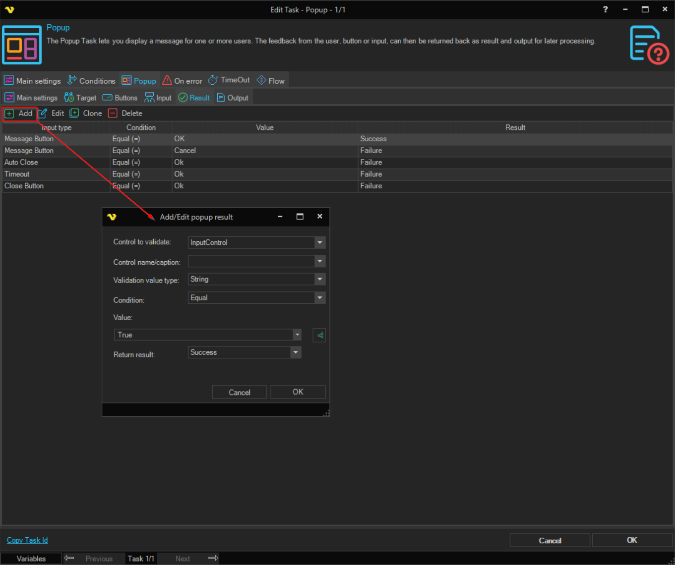
The Result sub tab decides whether the Task succeeds or fails, based on how the popup was closed and what the user chose or typed. Each row sets one check; click Add or Edit to open Add/Edit popup result:
- Control to validate: What the row checks: "Message Button", "Input Control", "Close Button", "Auto Close" or "Timeout"
- Control name/caption: For "Input Control", the input item to check
- Validation value type: For a text input, how the values are compared. With "String", larger and smaller compare the length of the text
- Condition: How the value is compared, for example "Equal"
- Value: The value to compare with
- Return result: "Success" or "Failure"
When the popup closes and a row that applies returns "Failure", the Task fails.
Popup: Output sub tab
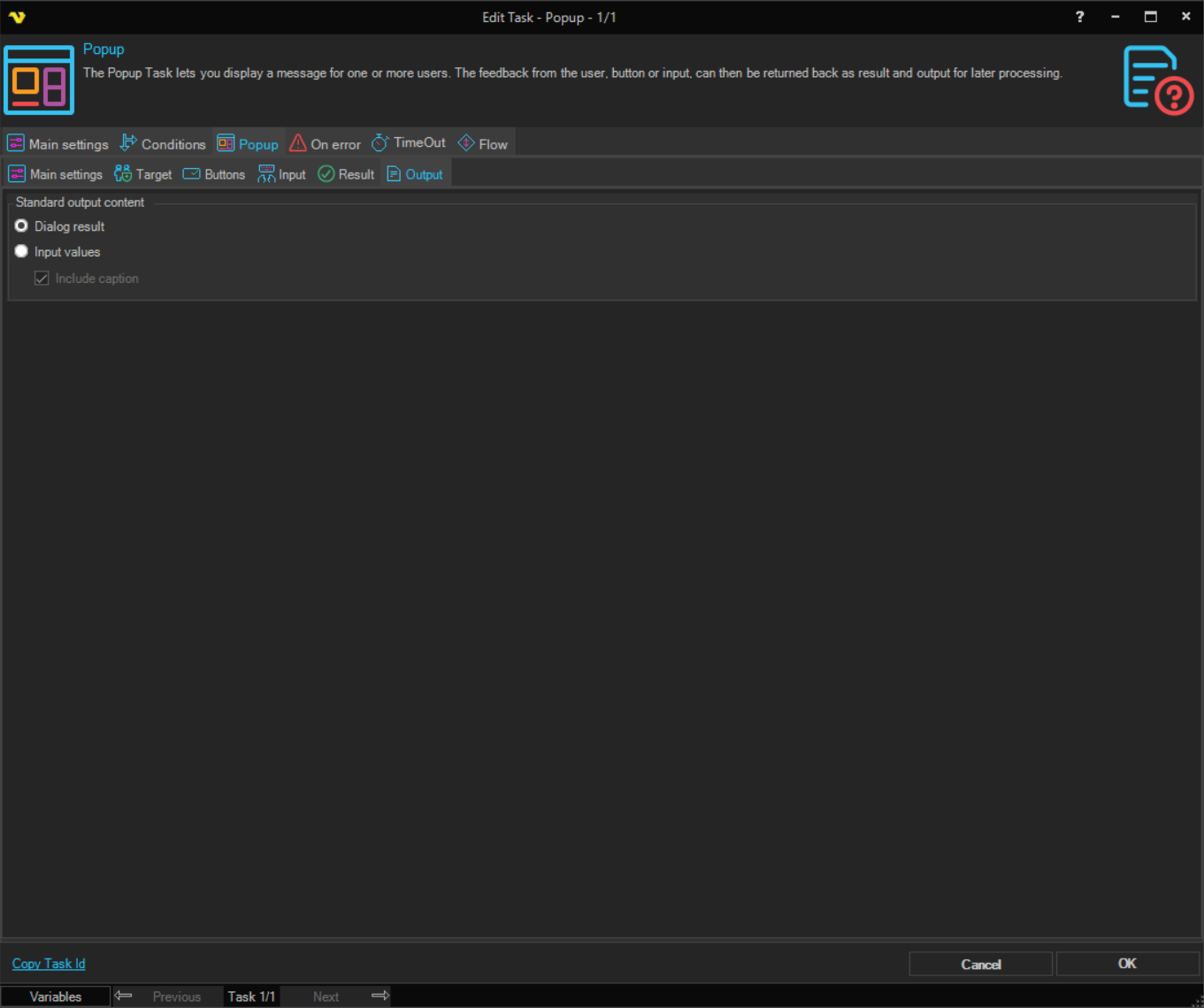
- Dialog result: The output is the value of the button the user clicked. The default
- Input values: The output is the values the user entered or selected, one per line for check boxes and text boxes; for radio buttons, the selected item only
- Include caption: With "Input values", puts the caption in front of each value, as
caption=value. Selected by default
Output and errors
- The Task waits until a user replies, the popup closes itself (Auto close after), or the time on the TimeOut tab runs out. With Auto close after cleared and no time-out, the Task waits until a user replies
- If no target Client is connected, the Task fails with "No target Connection found"
- If a row on the Result sub tab returns "Failure", the Task fails